Overview
UXIE is a peer-to-peer platform for UX and product designers to validate work, run structured design tests, and get feedback from people who actually understand the decisions they're making. It fills the gap between portfolio platforms (which broadcast but don't validate) and mentorship networks (which are people, not process).
The idea: community participation is the mechanism for getting better at design. Every interaction on UXIE — running a test, reviewing a prototype, writing an article — creates value for someone else. The platform is built so contribution and benefit are inseparable.
The problem
UX designers share work on Behance and Dribbble. They get likes, not feedback. They network on LinkedIn, but it's too broad and too professionally polished to generate honest critique. ADPList offers mentors, but demand outstrips supply and sessions aren't structured around specific work.
Designers in growth stages — especially those transitioning from graphic to UX, or mid-career designers working on complex B2B products — had nowhere to get rigorous peer validation from people who understand the specific constraints they're designing under. The problem wasn't lack of community. It was lack of context.
Research
A structured survey ran across two rounds, gathering qualitative and quantitative responses from active designers across roles. The sample was intentionally broad — product, UX, UI, and graphic designers — to understand where needs converged and where they diverged by role.
The signal that changed the design direction: designers weren't asking for more places to share. They were asking for a structured way to get tested — to put their prototypes in front of real designers who would actually engage with the flows, not just comment on aesthetics.
Affinity Map — Research ThemesUser Personas
Three distinct personas emerged from the research — differentiated not just by role title, but by where they are in their career trajectory and what they're actually blocked on.
Bengaluru
"I want someone to tell me if my navigation actually makes sense — not just if it looks nice."
- Structured feedback on UX flows
- Credibility beyond a visual portfolio
- Peers at a similar career stage
- Dribbble only rewards visual polish
- No structured flow-level feedback
- Feels out of place transitioning roles
- Figma, Behance, LinkedIn
- ADPList (on waitlist)
Mumbai
"I'd participate if the signal-to-noise ratio was better than LinkedIn."
- Validate decisions with experienced peers
- Discover emerging talent worth following
- Give back without hours of overhead
- Time-poor — needs high trust, low friction
- LinkedIn engagement is performative
- Can't find designers doing similar work
- Figma, Notion, Read.cv
- LinkedIn (reluctantly)
Hyderabad
"I don't need a mentor. I need someone who'll look at my work and tell me what's broken."
- Learn UX research by doing, not watching
- Get portfolio validated by practitioners
- Transition from agency UI to in-house UX
- Mentorship platforms are too unstructured
- No way to test her assumptions with peers
- Work looks "pretty" but can't prove it works
- Adobe XD, Behance
- UXIndia community (events)
Competitive Analysis
No existing platform served UX designers with both peer validation and structured testing tools. Platforms either had community without tooling, or tooling without community.
| Platform | UX-Specific | Peer Validation | Design Testing | Mentorship | Community |
|---|---|---|---|---|---|
| Behance | ✗ | ✗ | ✗ | ✗ | ✓ |
| Dribbble | ✗ | ✗ | ✗ | ✗ | Partial |
| ✗ | ✗ | ✗ | Partial | ✓ | |
| ADPList | ✓ | ✗ | ✗ | ✓ | Partial |
| Read.cv | Partial | ✗ | ✗ | ✗ | ✓ |
| UXIndia | ✓ | ✗ | ✗ | Partial | ✓ |
| UXIE | ✓ | ✓ | ✓ | ✓ | ✓ |
Design decisions
Three decisions defined the shape of UXIE. Each one resolved a genuine tension — where the "obvious" approach would have produced a worse product.
Early explorations treated researchers (people running tests) and participants (people taking them) as two separate user types — different onboarding, different dashboards, different value propositions. This felt logical on paper but created an artificial split. Most designers want to do both: run tests on their own work and participate in others' to earn credits and stay sharp.
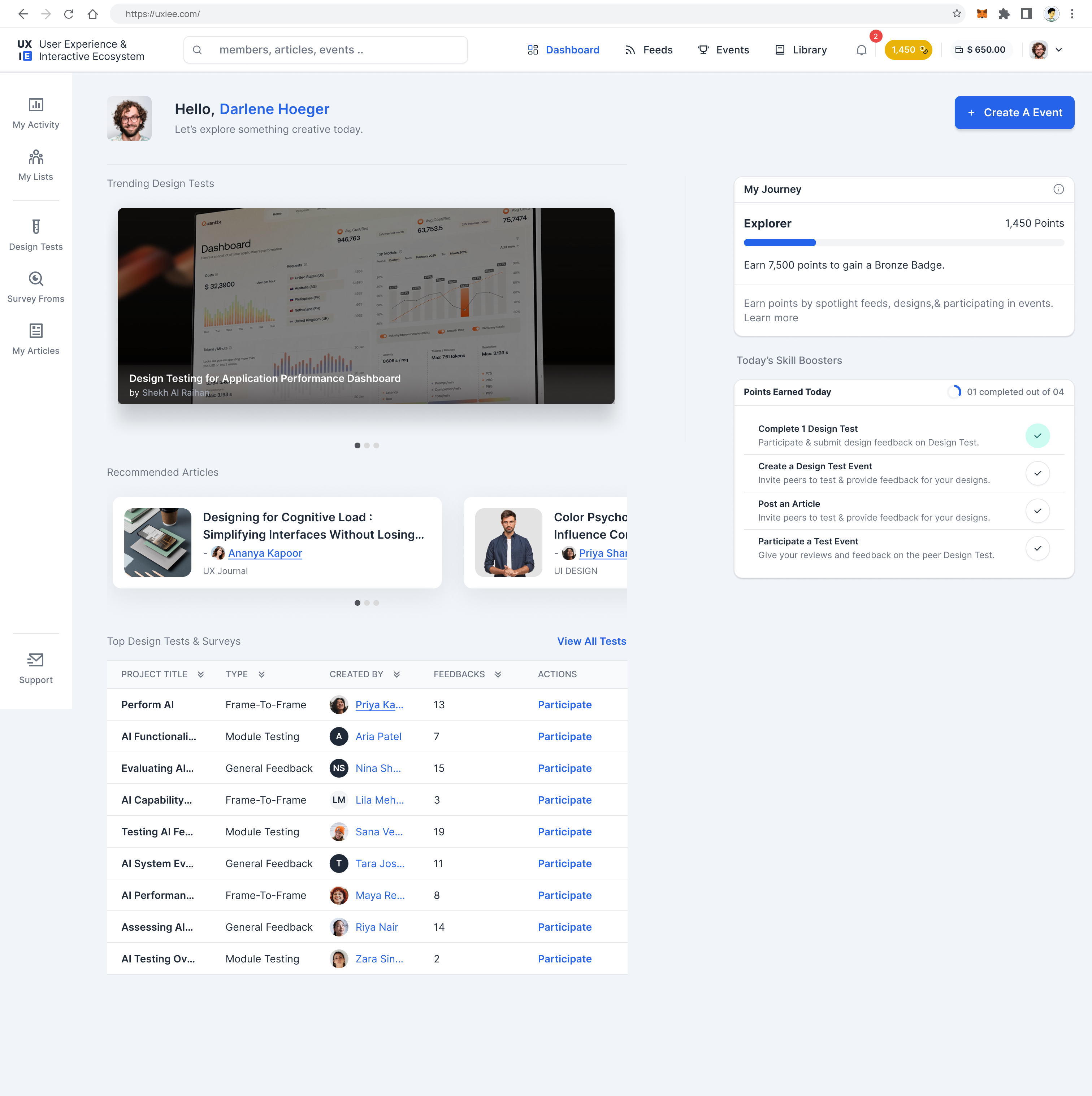
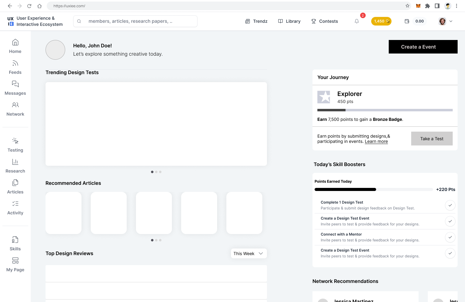
One account, two modes. Researcher mode to create and manage tests; Participant mode to discover and join running tests. Participation earns credits that unlock researcher features — making the loop self-reinforcing.
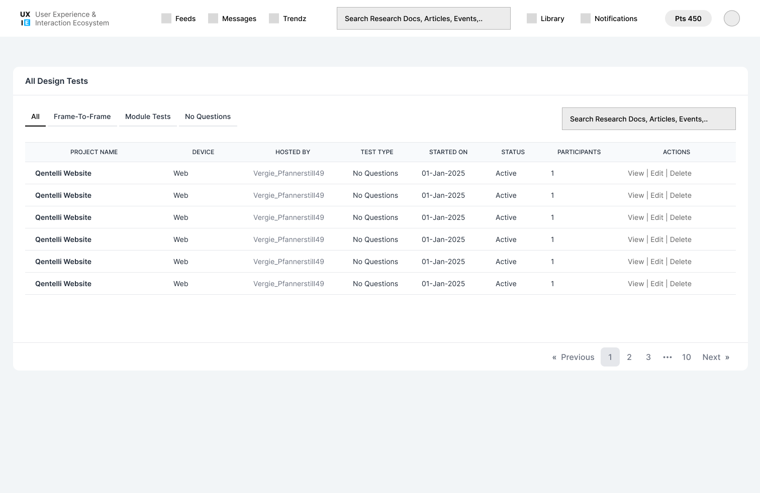
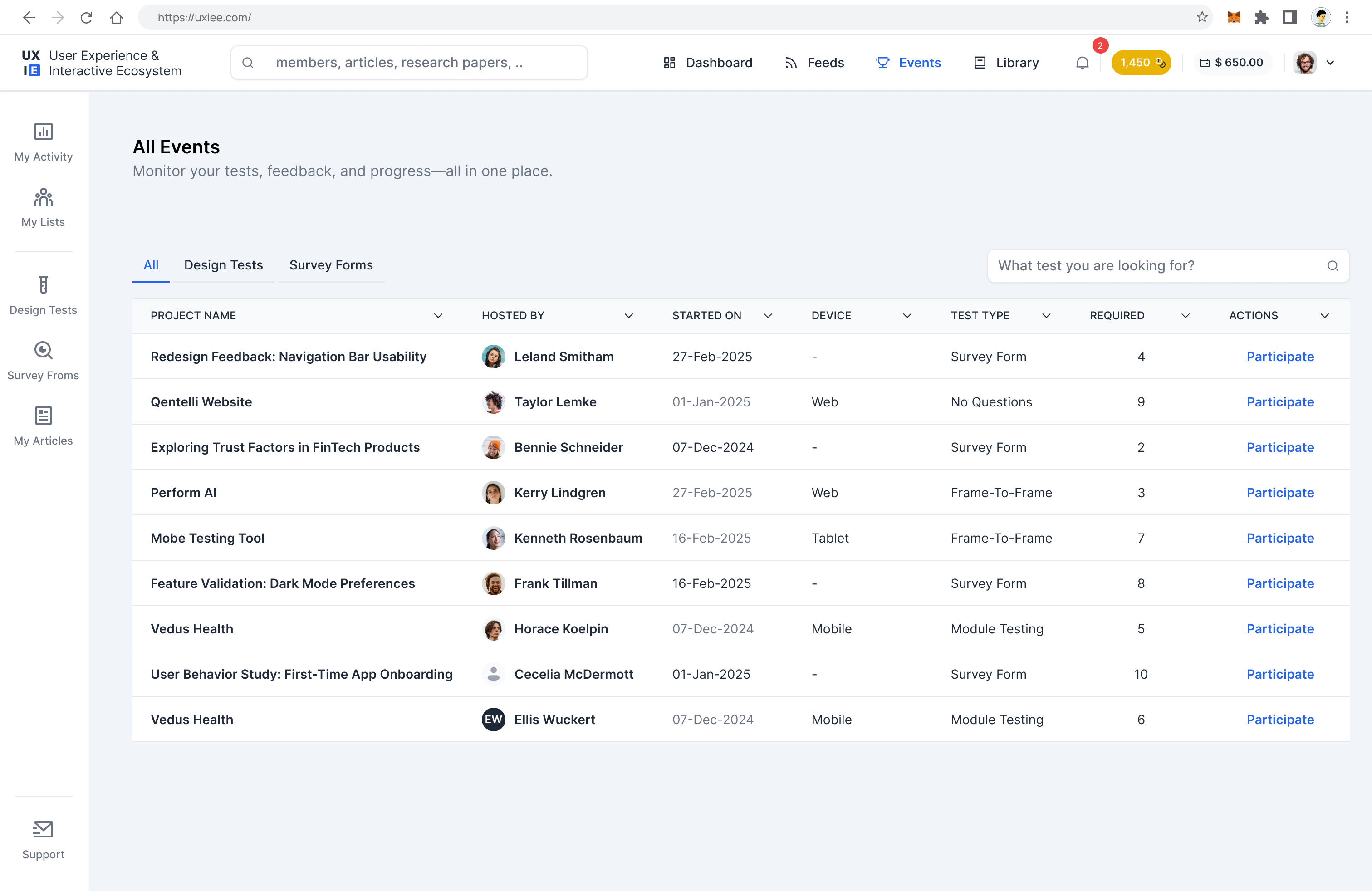
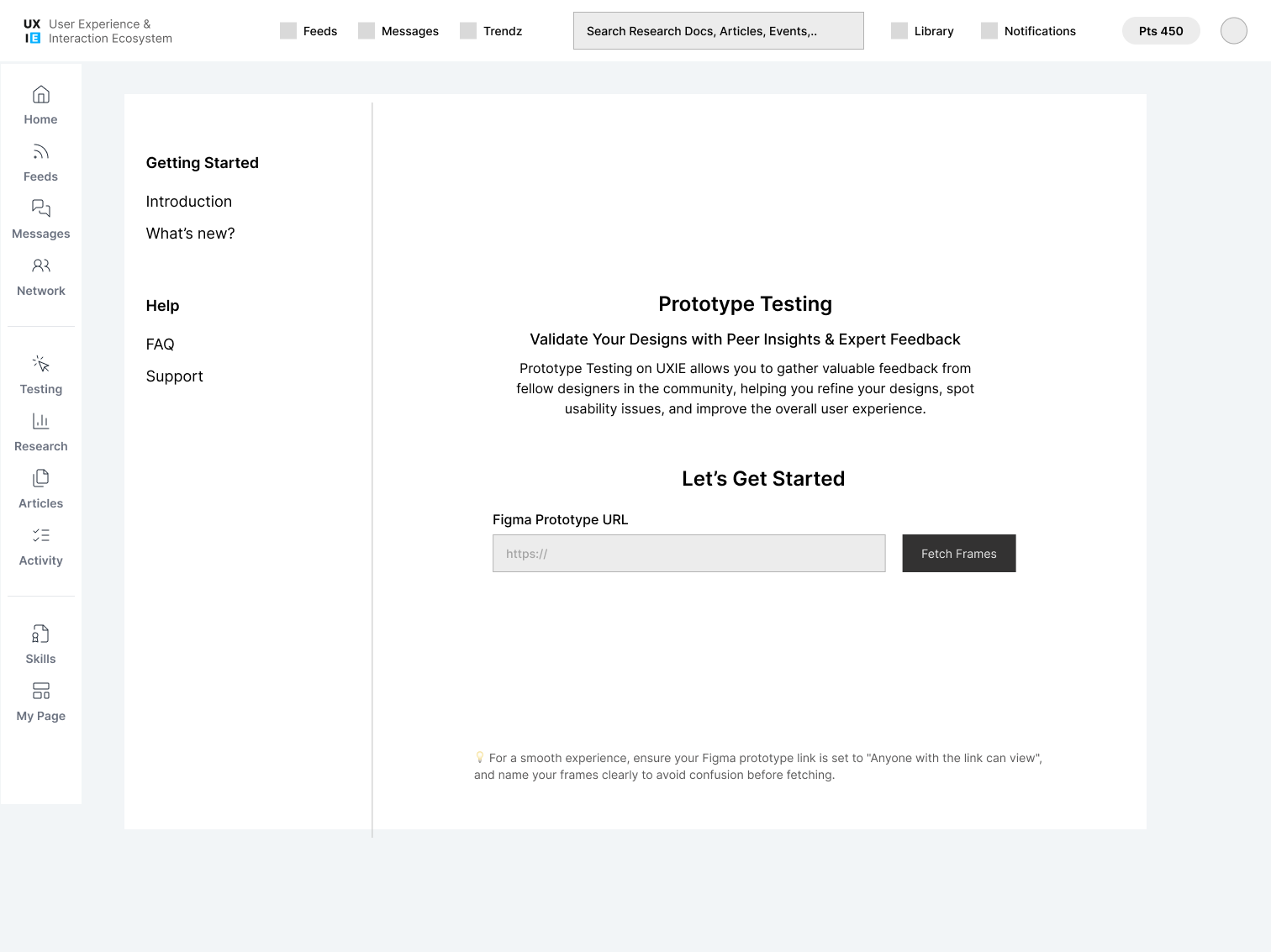
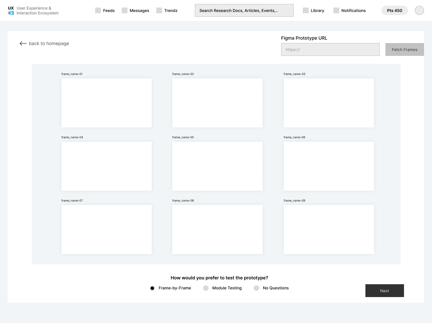
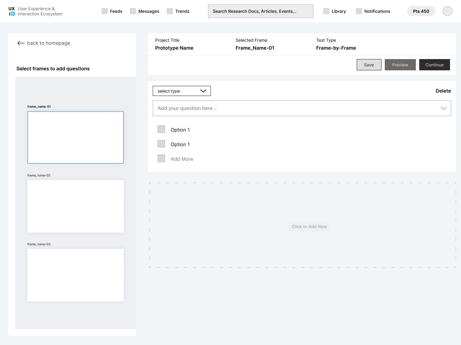
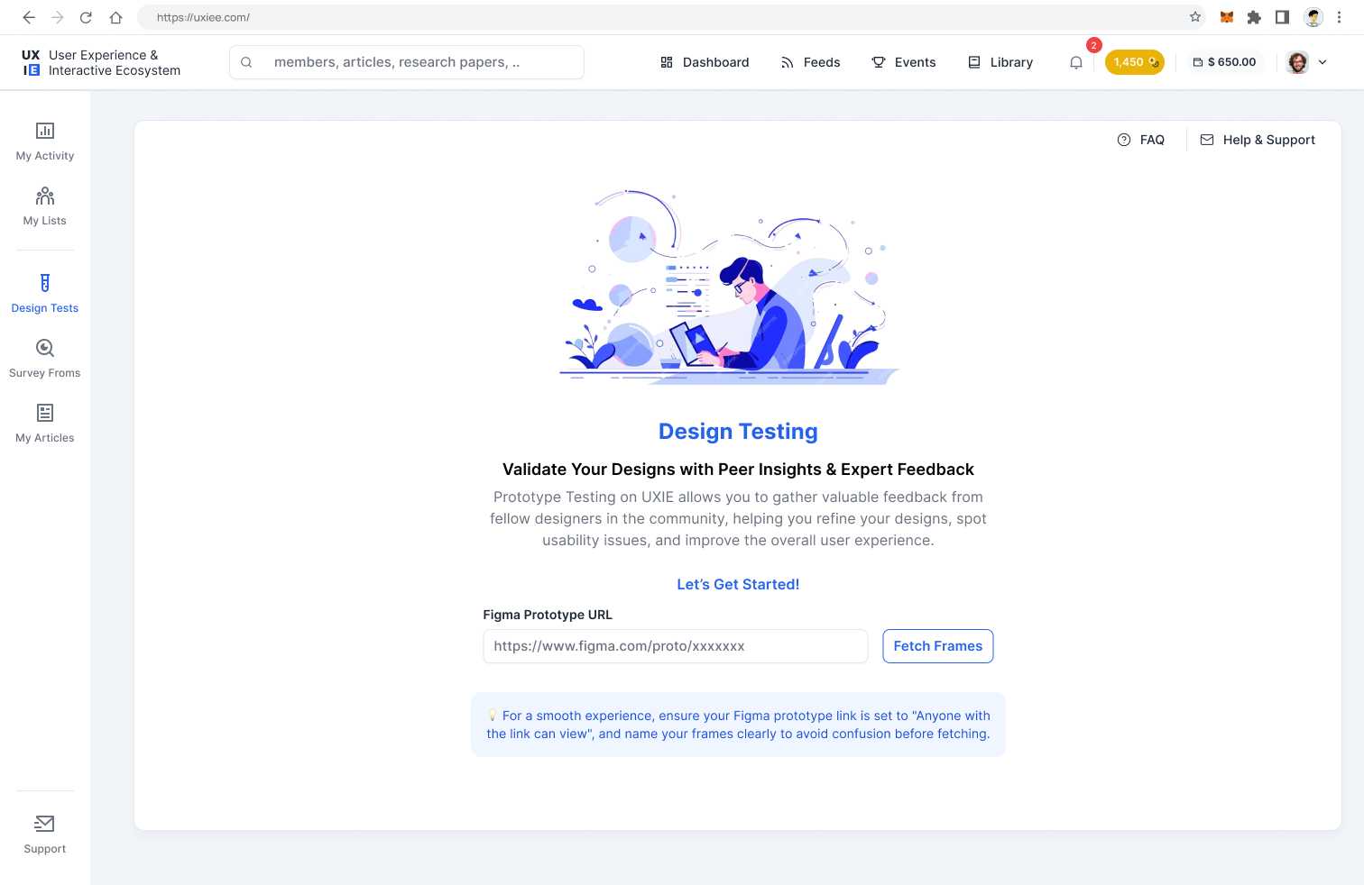
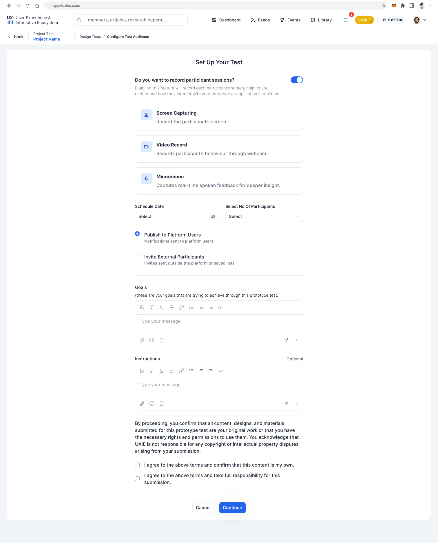
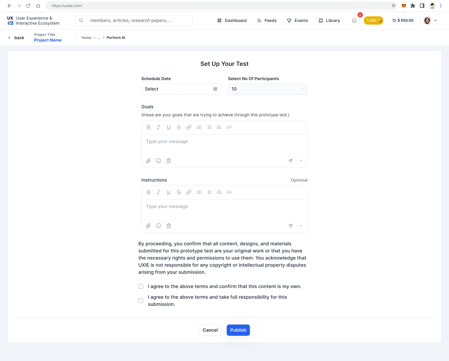
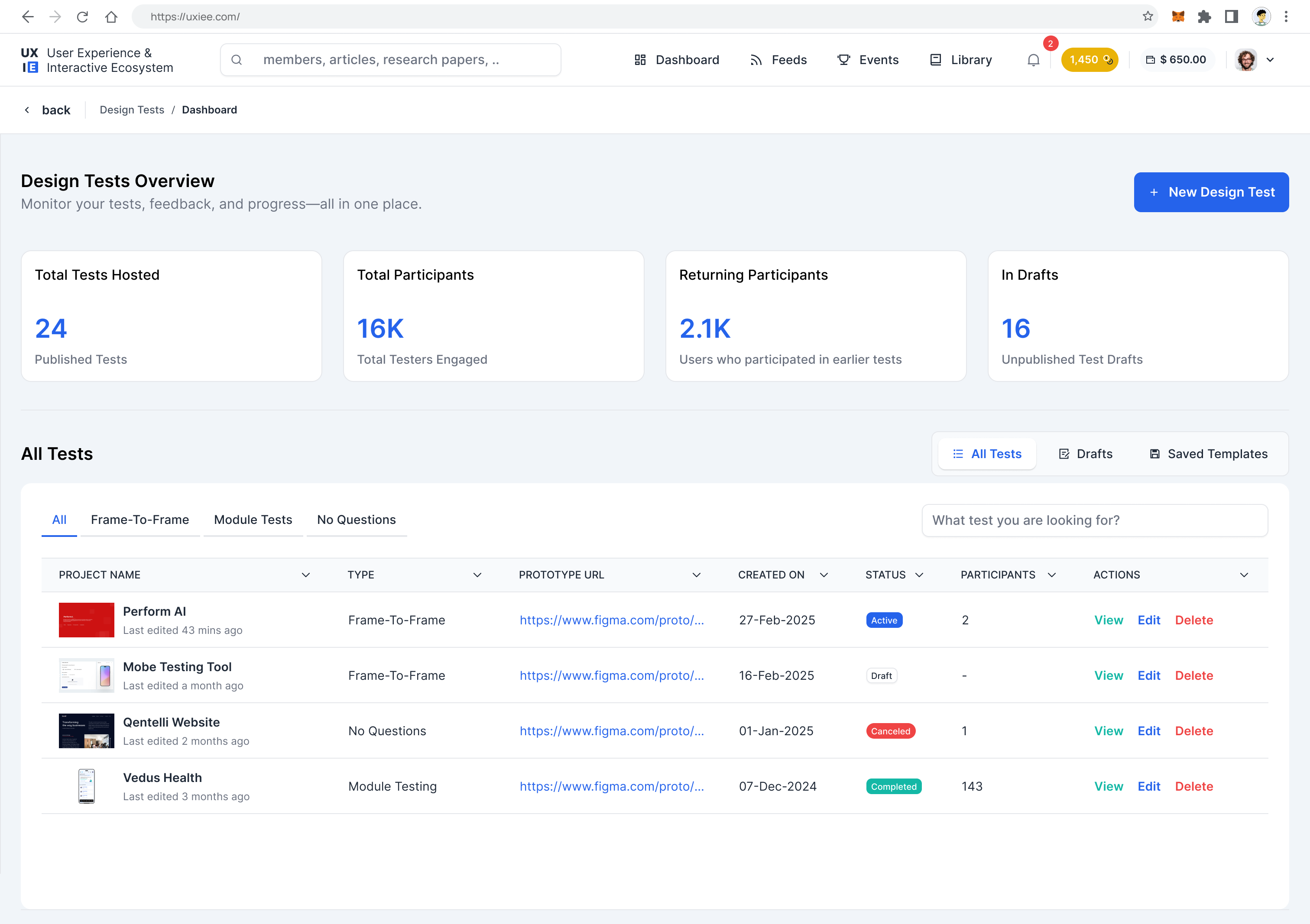
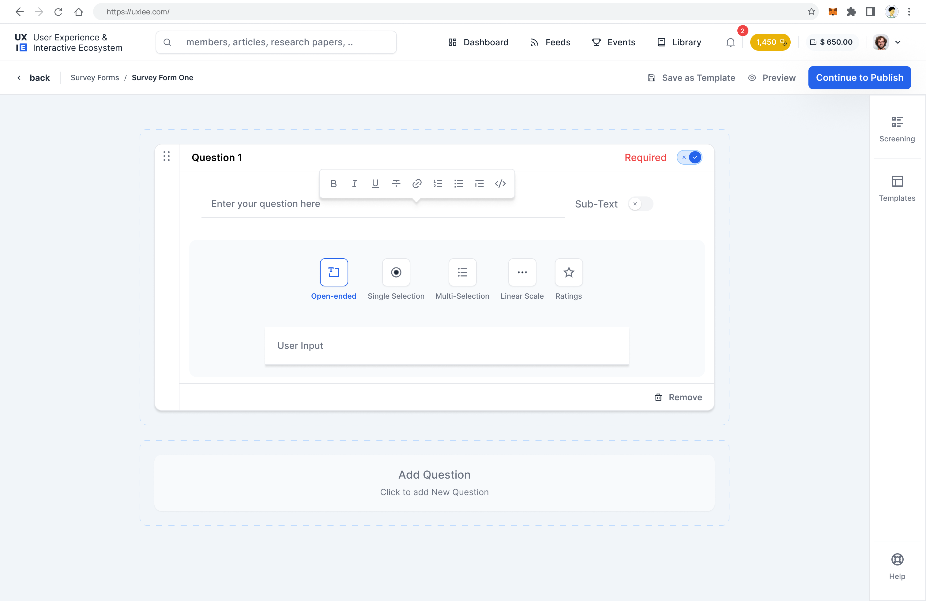
The blank "create a test" canvas was the biggest failure in early prototypes. Without structure, researchers didn't know what a good test looked like, and the resulting tests were too vague to generate useful participant data. Participants dropped off because they couldn't tell what was being tested.
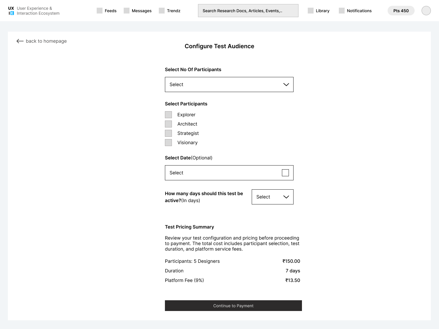
The fix: enforce a strict linear flow. Project details → fetch prototype screens → configure screening questions → set test questionnaire → confirm and publish. Each stage locked until the previous one was complete.
The original roadmap had a standalone "Community Feed" section — a scrollable stream of posts and updates. Research quickly showed this would become a ghost town. A feed with no forcing function produces the worst of both social platforms: low-quality noise from heavy posters, silence from everyone else.
Community is a byproduct of participation. Discussions happen inside tests — tied to specific screens and questions. Articles attach to user profiles and appear in feeds only after meeting a quality threshold. You never need to "post" to get discovered — doing the work is the contribution.
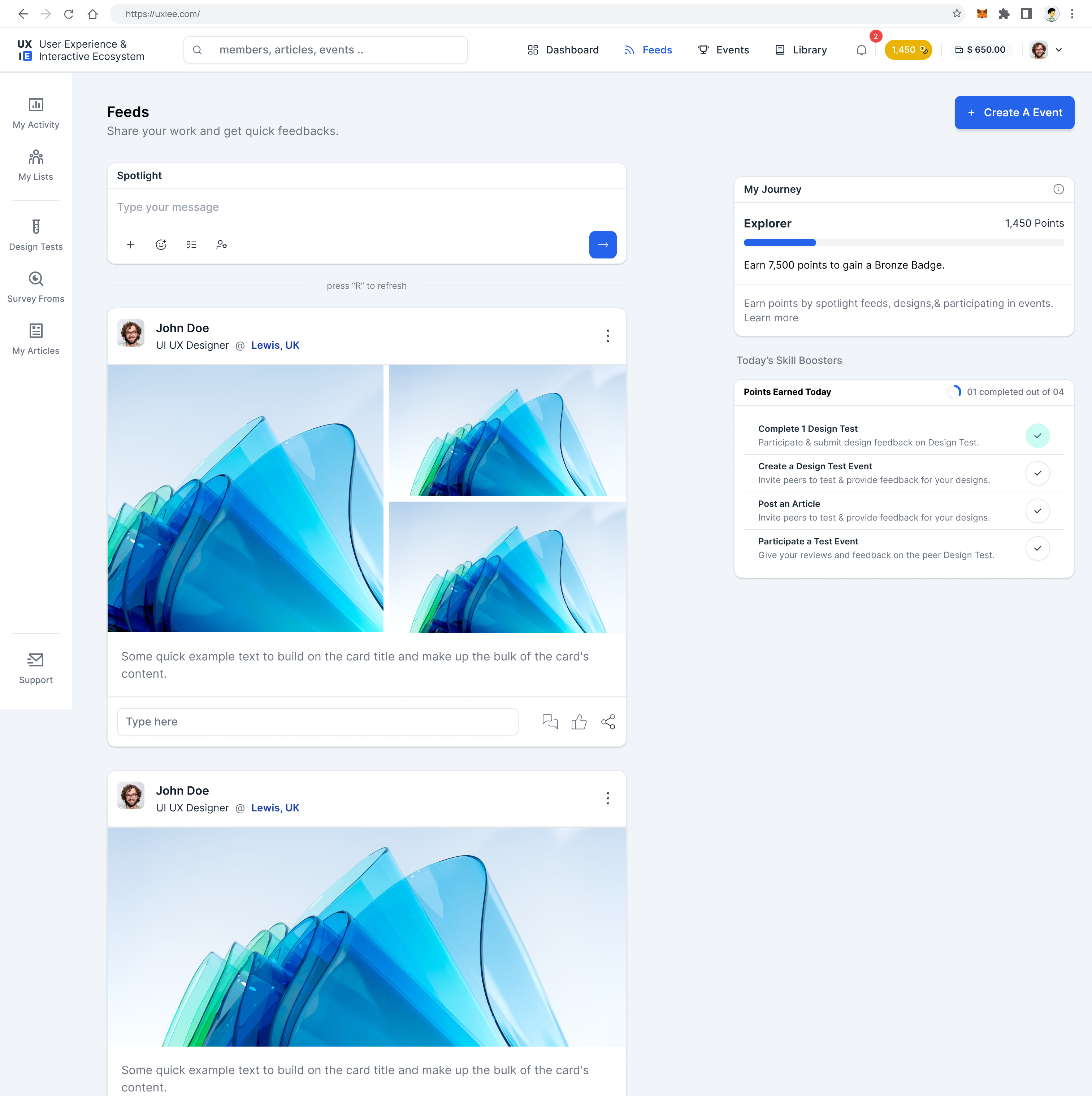
Hi-fi screens
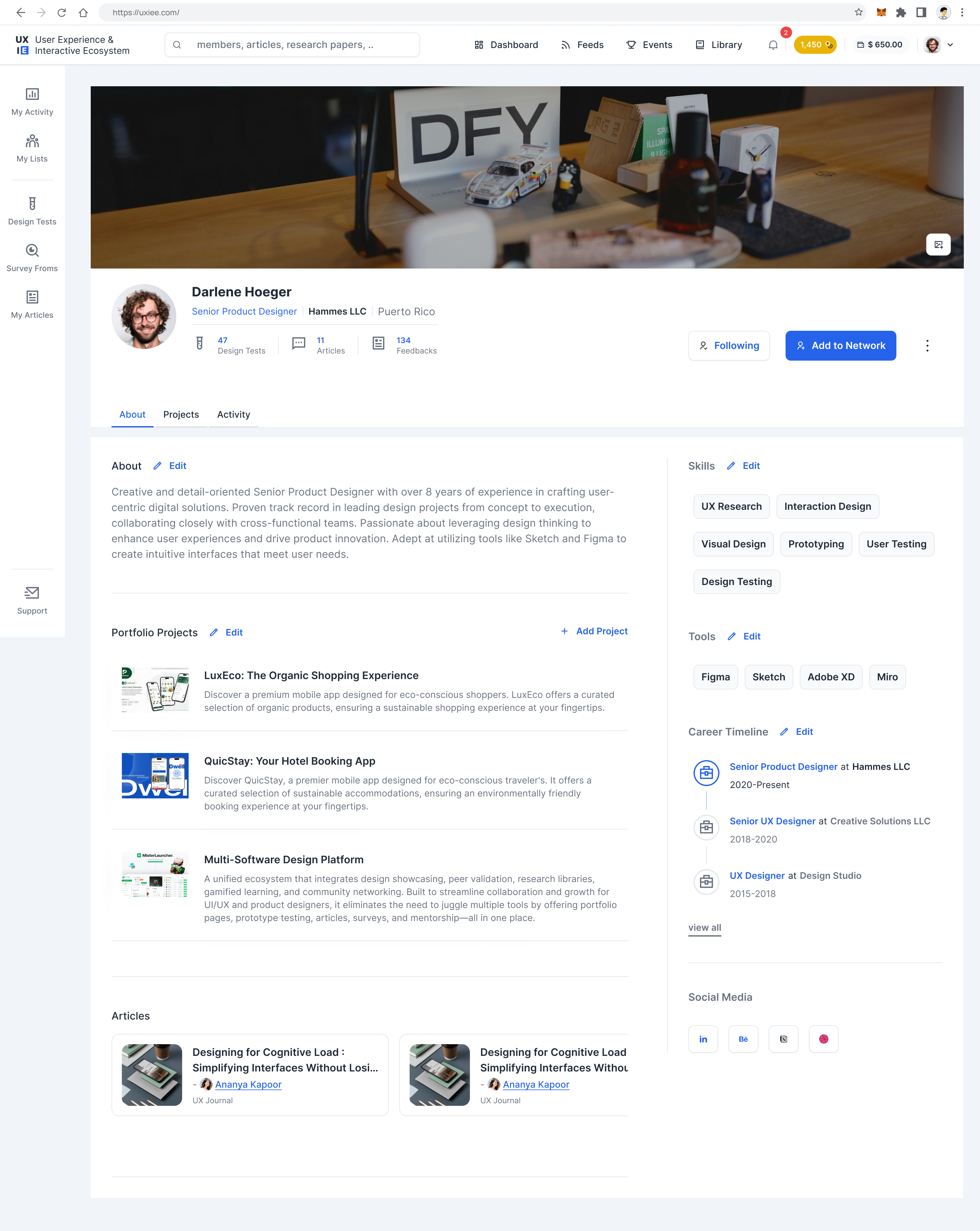
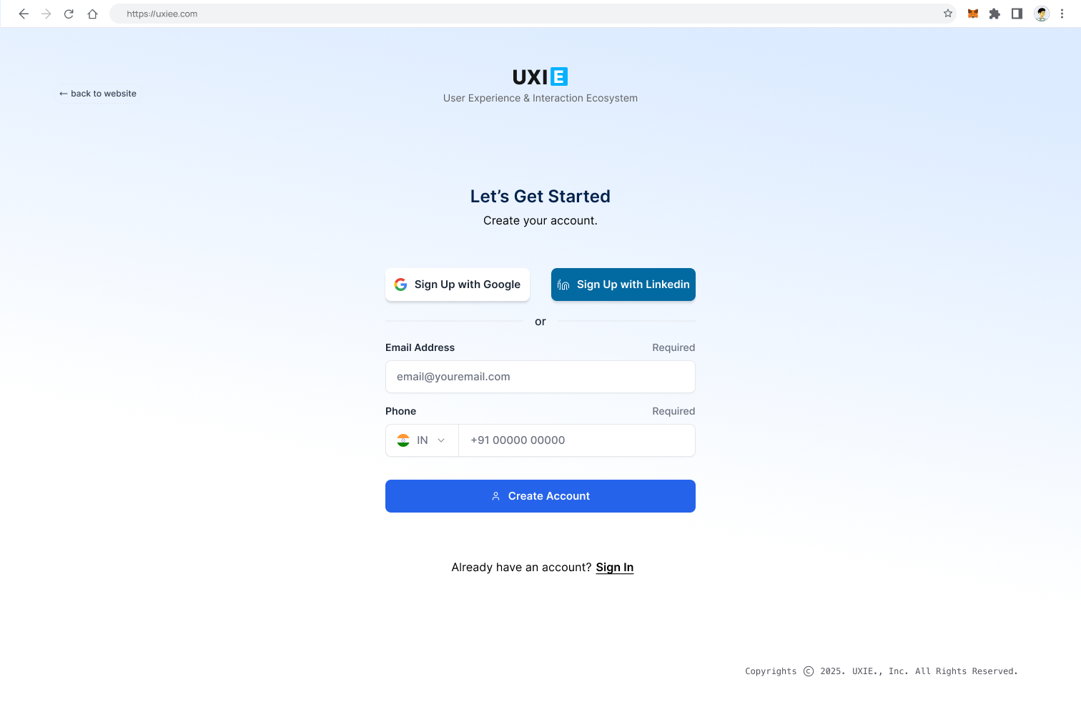
Selected screens across the core flows. The design system uses a purple-dark palette with high contrast supporting extended session use.
Outcomes & reflection
UXIE reached a working design system and validated its core flows through prototype testing sessions by mid-2025. Development was paused in October 2025 — not because the design failed, but because the market shifted underneath it.
The rise of AI-native design evaluation tools in 2025 fundamentally changed the assumption UXIE was built on. The platform was designed around the premise that peer humans are the most valuable critics of UX decisions. As the industry moved toward AI-generated heuristic analysis, automated usability scoring, and synthetic participant testing at scale, the ROI case for peer-based validation became harder to make. AI tools could deliver structured feedback instantly, with zero coordination overhead and no cold-start problem. The network effects that UXIE needed time to build were being replaced before the time was available.
The problem UXIE was solving didn't disappear. The expected solution did. That's a product lesson worth keeping: market timing is a design constraint you can't sketch your way around. The peer-validation hypothesis still holds — contextual critique from experienced designers is genuinely more useful than automated heuristics for complex product decisions. The platform for delivering it will just look different than what we built.
What I'd do earlier in a repeat: treat AI as a co-evaluator from day one rather than positioning peer humans as the alternative to it. A hybrid model — AI for fast first-pass feedback, human peers for the contextual review AI can't provide — would have been both more defensible and more useful to the designers we were designing for.